Type of Widgets
There are ten types of widgets in the Widget Type dropdown menu, and the options available, and each type has its own best use, depend on the number and type of data from your telemetry. It is important to ensure that all selected telemetries have the same unit of measurement.
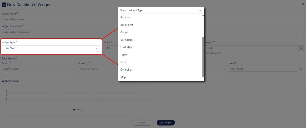
All of your selected telemetry will display its preview on the Widget Preview.
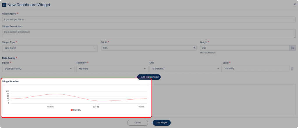
After setting up your Dashboard, click Add Widget when done, to make your widget appeared on the Dashboard menu.
Types of Chart
Line Chart
A line chart is a graph with ascending and descending lines that connects several data points. Line chart is the simplest to read of all chart types.

Line chart is commonly used to show trends and changes over time, and this chart is particularly useful when there are subtle differences or fluctuations in the data. By connecting individual data points with lines, a line chart can help to visualize patterns and trends that may not be as apparent in a bar chart. Additionally, line chart often used to compare multiple sets of data, making it easier to see similarities and differences between different telemetry measurements.
Bar Chart
A bar chart is a type of graph that displays categorical data by using rectangular bars with heights or lengths proportional to the values they represent.

A bar chart is a graphical representation of data in which different values are represented by rectangular bars. When comparing two groups of data, the bars can be aligned vertically or horizontally, with the lengths representing the magnitude of the values. When tracking changes over time, the bars can be arranged in a sequence to show the progression of values over time. A bar chart can be used to visualize data and highlight trends or patterns.
Area Chart
An area chart is a type of chart is a variation of a line chart, where the area below the plotted line is filled with color or a pattern to emphasize the magnitude of change over a given interval.

Area chart is good to use when you are tracking the changes in two or more related telemetries that belong to the same category. While area charts are useful for comparing and visualizing changes in related data sets over time or categories, they can be difficult to interpret when there are too many data sets or the differences in values between the sets are minor. In such cases, other chart types, such as bar charts or line charts, may be more appropriate because they allow you to clearly see the composition of each data set and compare their proportions. However, if you have just a few data sets, an area chart can be a simple and effective way to show the trend over time and the relative magnitude of each data set.
Gauge
A gauge chart, also known as a dial or speedometer chart, is a type of data visualization that is used to display a single quantitative value of data.

Gauge charts are best used when you need to visualize a single value and provide a quick and simple way to understand it at a glance, but they are not the best option if you want to draw deeper results from your data. If you need to show multiple values or relationships between values, other types of charts such as bar charts, line charts, etc. would be a better choice as they allow for a more in-depth analysis of your data.
Bar Gauge
A bar gauge is a visual representation of data that combines elements of a bar graph and a gauge. It uses bars of varying lengths to show a single numerical value, making it a useful tool for displaying data in an easy-to-understand format.

Some advantages include being easy to understand, displaying a single value effectively, and being compact. On the other hand, its disadvantages include limited data representation, lack of detail, and inadequacy for comparison purposes.
Heat Map
A heat map is a graphical representation of data that uses color to represent values. The color variation may be by hue or intensity, providing the reader with obvious visual cues.

Heat maps are most useful for visualizing complex data and identifying patterns and relationships. They are a useful tool for data analysis and decision-making because they provide a quick and intuitive way to understand data. However, heat maps have some drawbacks, including limited readability, the potential for information overload, a lack of accuracy, and limited scalability. These constraints should be considered when determining whether a heat map is the best tool for a specific data analysis task.
Table
The table widget only shown a simple numerical value (with the help of timestamp) in an organized and easy-to-understand format.

If you only need to display a single numerical value, a table chart may be a suitable choice. However, if you need to track changes in the data over time, a table chart may not be the best option. In such cases, it may be better to use other types of charts such as line charts, bar charts, or area charts to visualize the trends and changes in the data over time.
Card
The card widget displays information a simple numerical value with its compact display.

A card widget is typically used for presenting a single piece of information or data. As a static display component, a card widget typically does not include the functionality for tracking changes in the data it displays. You may consider using another type of chart to visualize the trends and changes over time.
Controller Widget
A controller widget only works when the telemetry you choose is a controller type. This means that the widget will only work properly with telemetry data that is specifically dedicated as a controller and may not work with other types of telemetry data.
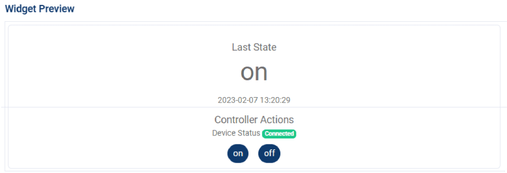
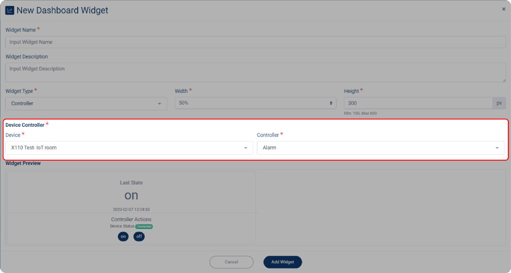
If you select a controller widget, you must set the data source from the controller-equipped device. To do so:
1. Select the controller from the Controller dropdown menu; however, only one controller can be selected at a time.
2. Click Add Widget when done.
Map Widget
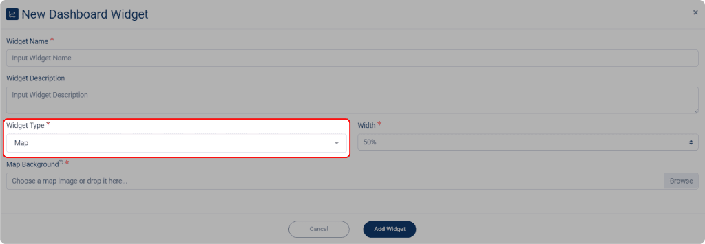
When you have a map of your room, you could use this widget to pin a label on the specific area where the device is located.
1. To do so, select Map on Widget Type dropdown menu.
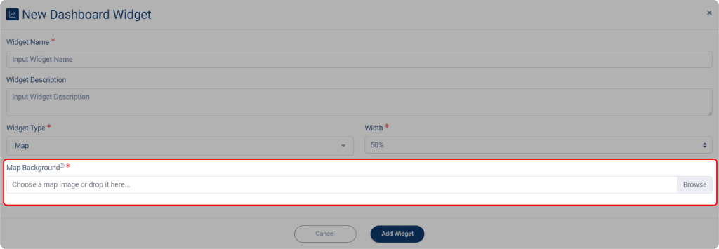
2. After you select the Map widget, click on the Map Background to select your map.
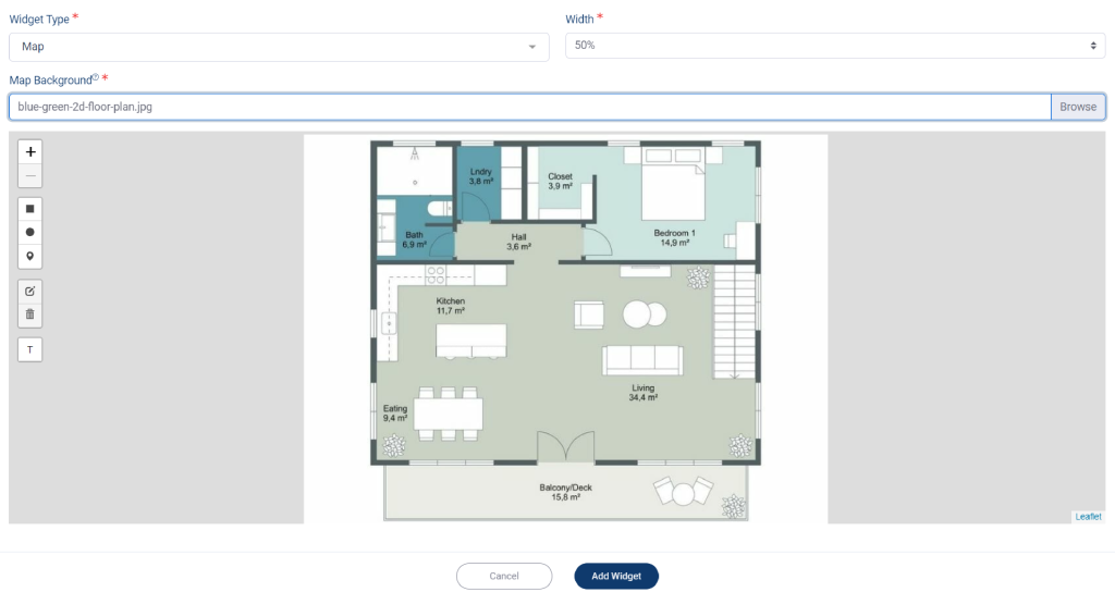
3. After selecting your map, it will appear. You can then add labels or markers to specify the location of your device or sensor.
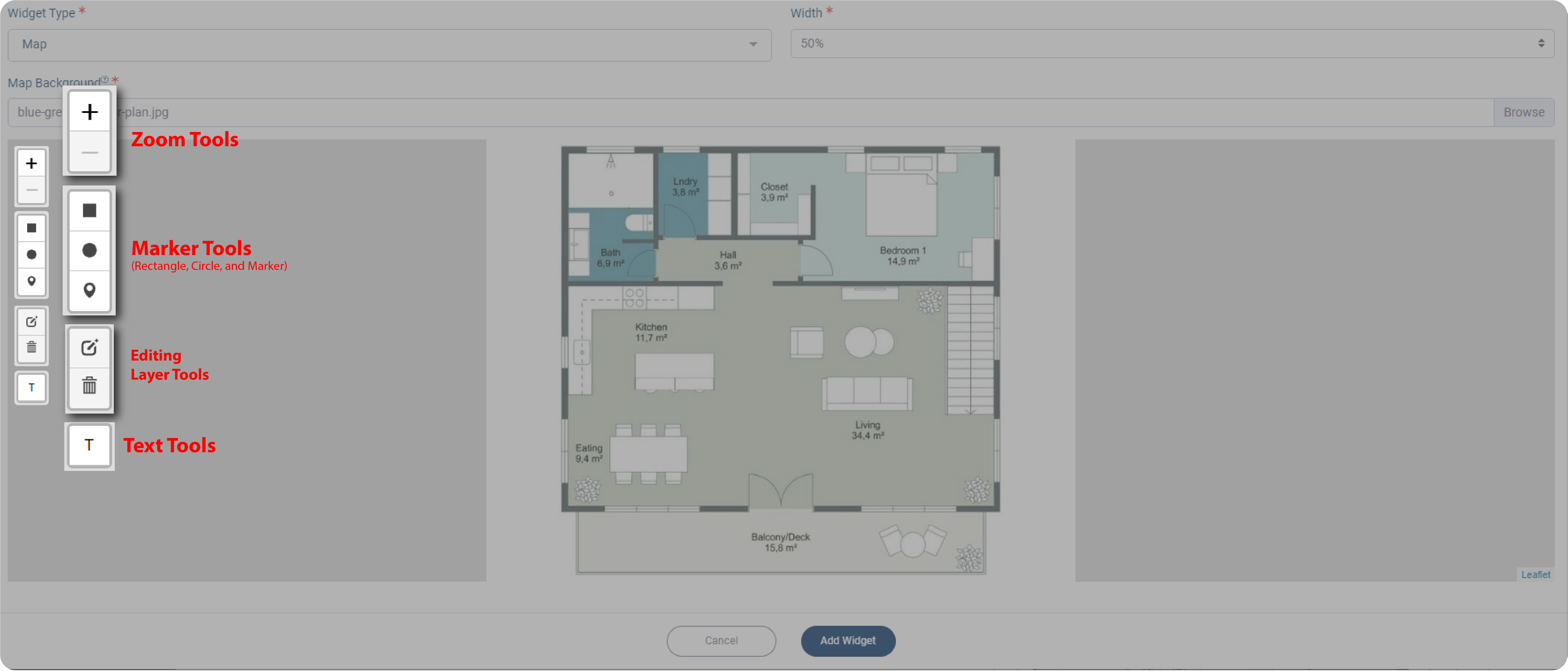
*Notes: There are three options to mark your map: rectangle, circle, and marker. You can use the mouse scroll or click on the ‘+’ or ‘-‘ icon to zoom in or out on the map. The Text Tools are used to make a label with text, while the Editing Layer Tools are used for editing after you select one of the Marker Tools.
4. Put a label on your map, click on it, then scroll your screen down to see more settings for your label.
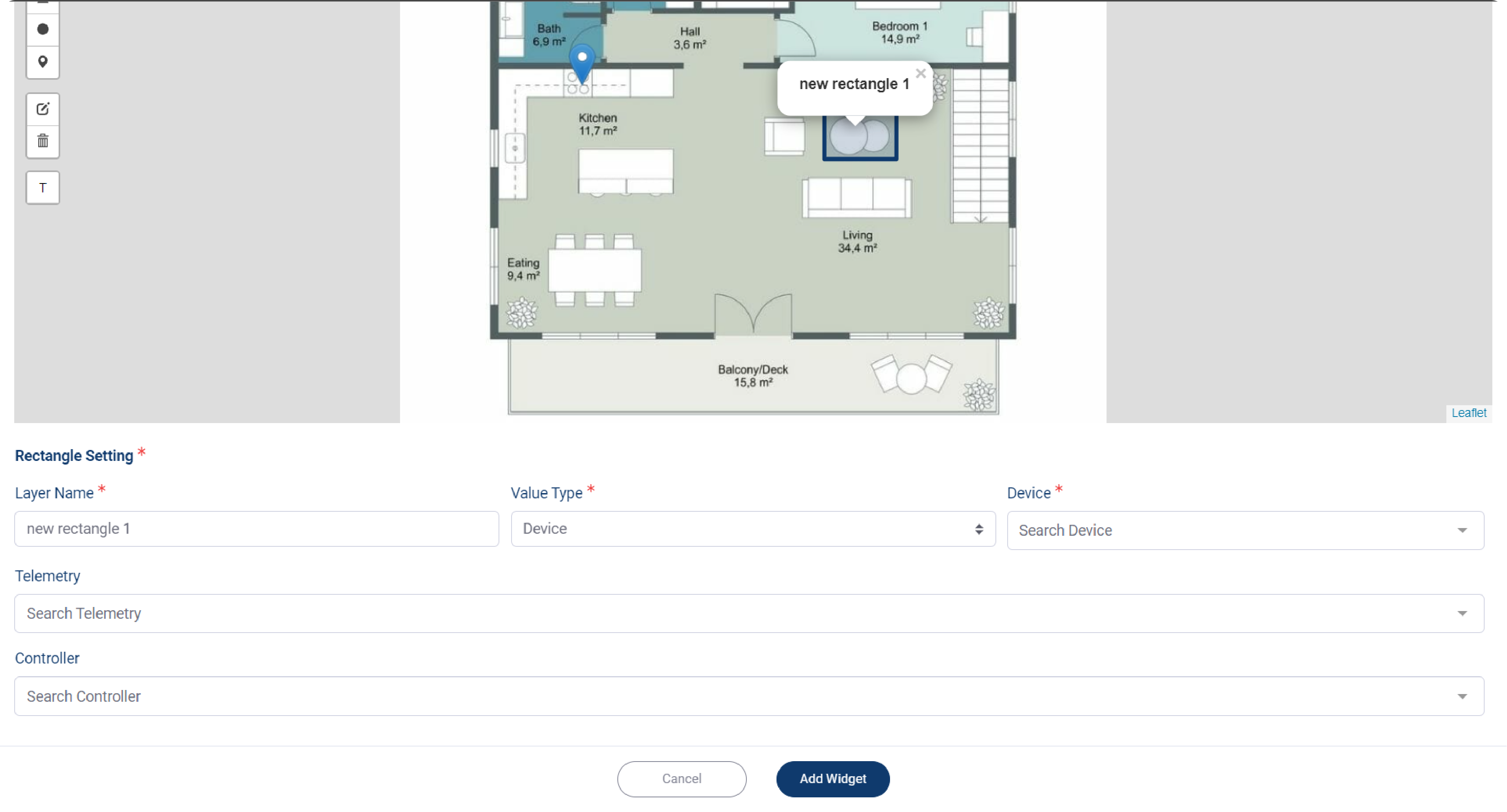
5. Select your device from Device dropdown menu.
6. If your mark is designated for your telemetry, then select your telemetry from Telemetry dropdown menu, which you can select for more than one telemetry.
7. Change your label name on Layer name field, it could be the same as your device name, or your telemetry name.
8. Set the Value Type, from which you can choose between Device and Location; each type has different options.
Device Type
1. When you choose Device as your Value Type, then select your device from the Device dropdown menu.
2. If the label contains either telemetry or a controller, you need select one of the two.
3. If your marked label only contains a device, you can skip selecting the telemetry and controller.
4. Give your layer a name, then click Add Widget when done.
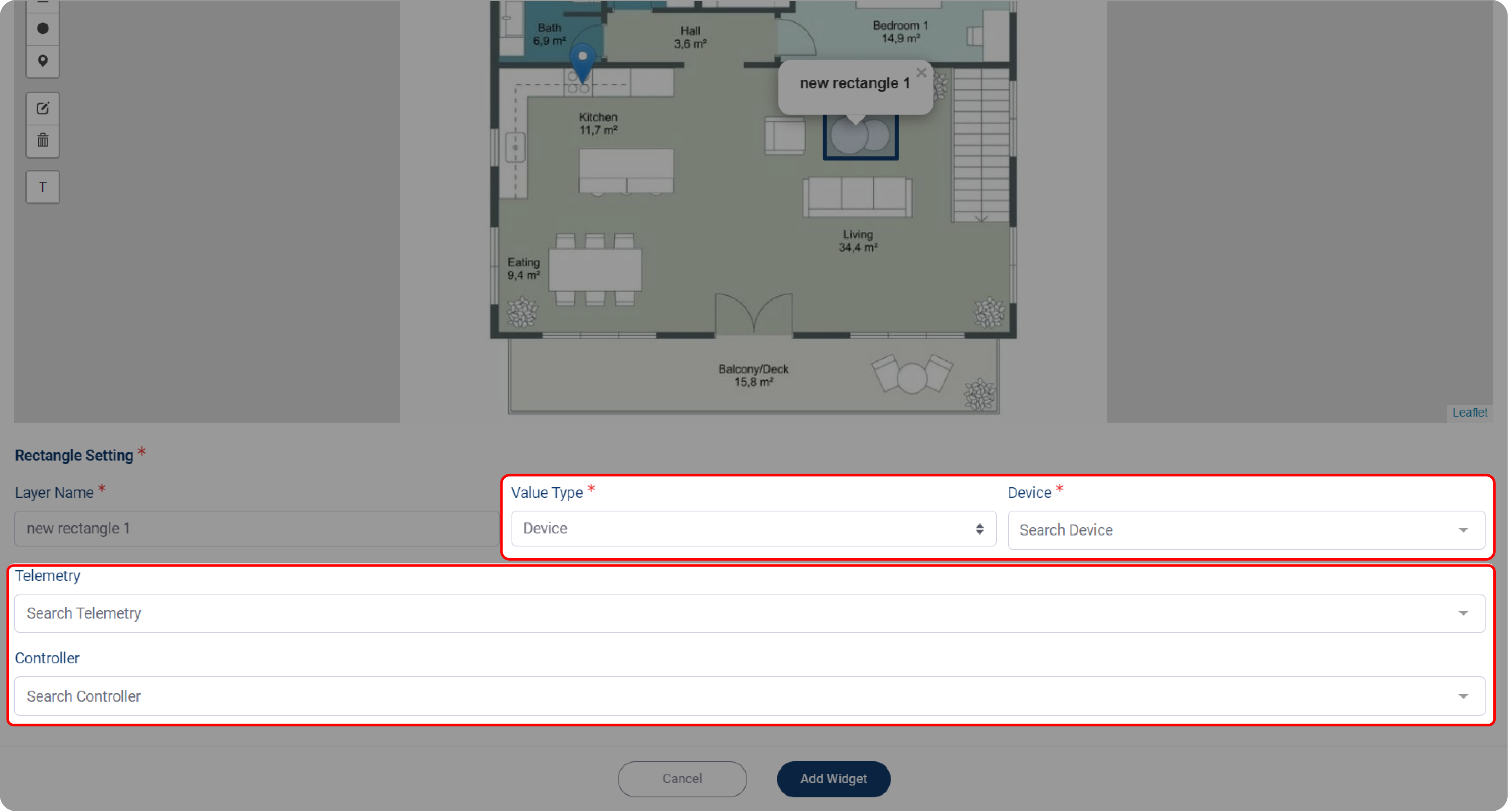
The option above only available with rectangle, or circle label.
But when you choose marker label, you also need to determine the Marker Style.
1. On the Marker Type dropdown menu, there are two options that you might choose: Image, or Telemetry.
2. When you choose Image, then you need to upload your device’s image, by click on Marker Icon field.
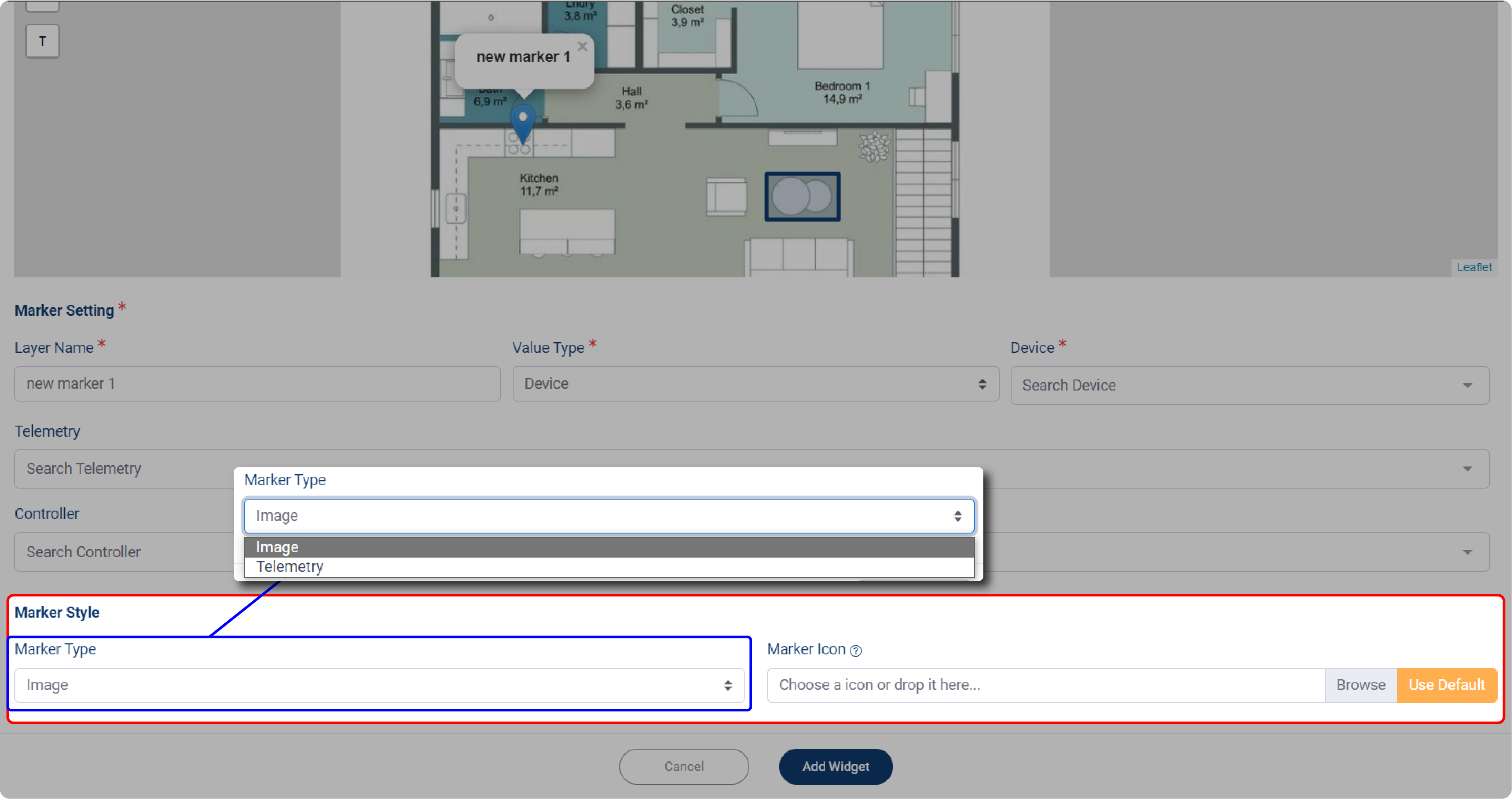
3. If you select Telemetry, you must first specify your Device before selecting Telemetry.
*Notes: The number of options on Telemetry Marker is determined by the number of Telemetry you selected previously.
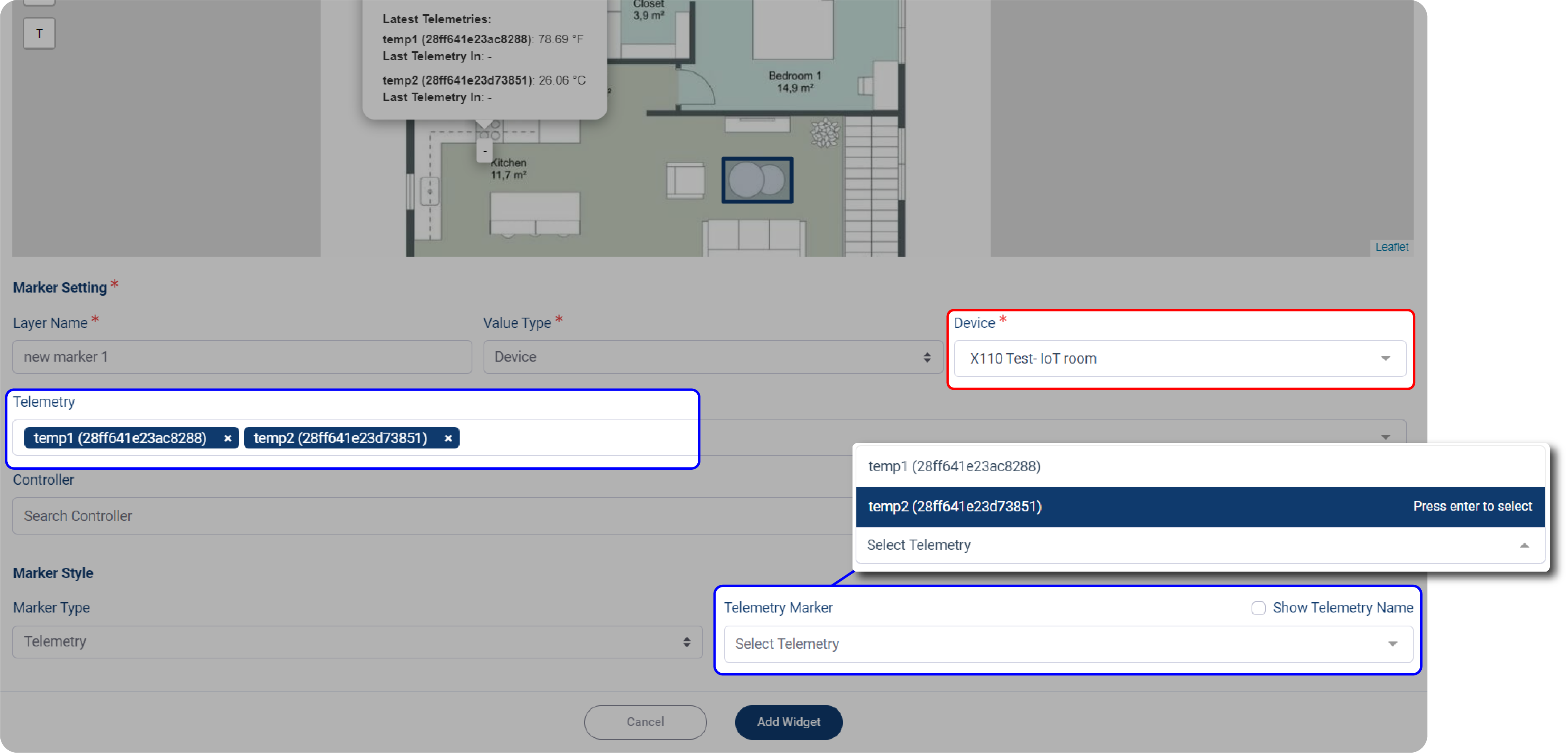
4. Click Add Widget when done.
Location Type
1. When you choose Location as your Value Type, then select your location from the Location dropdown menu.
2. Make sure you have a list of locations you already made.
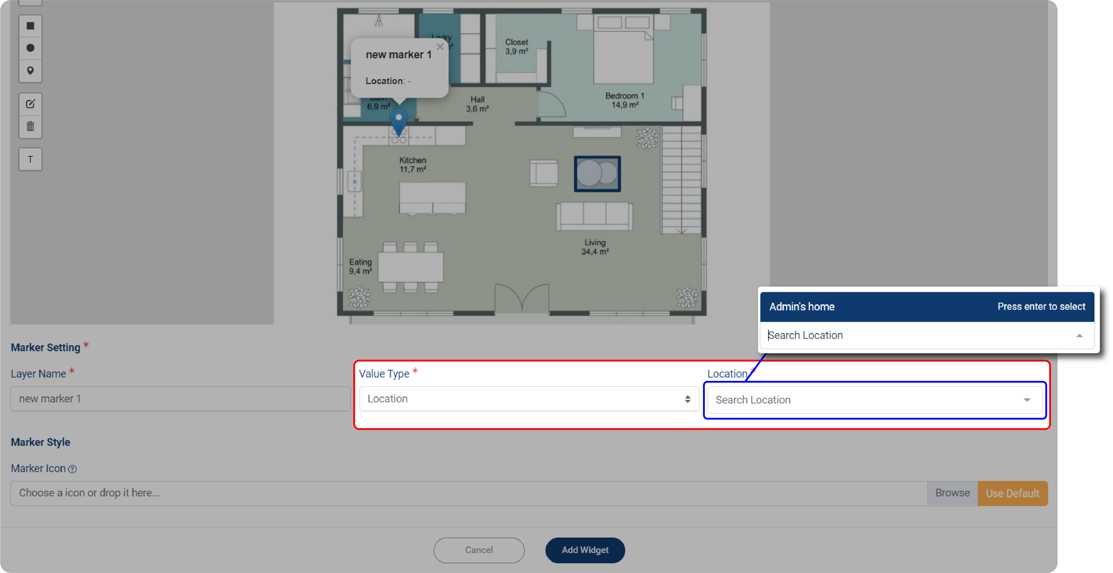
3. Choose your Location, then set the Location Detail, the more detailed location would appear.
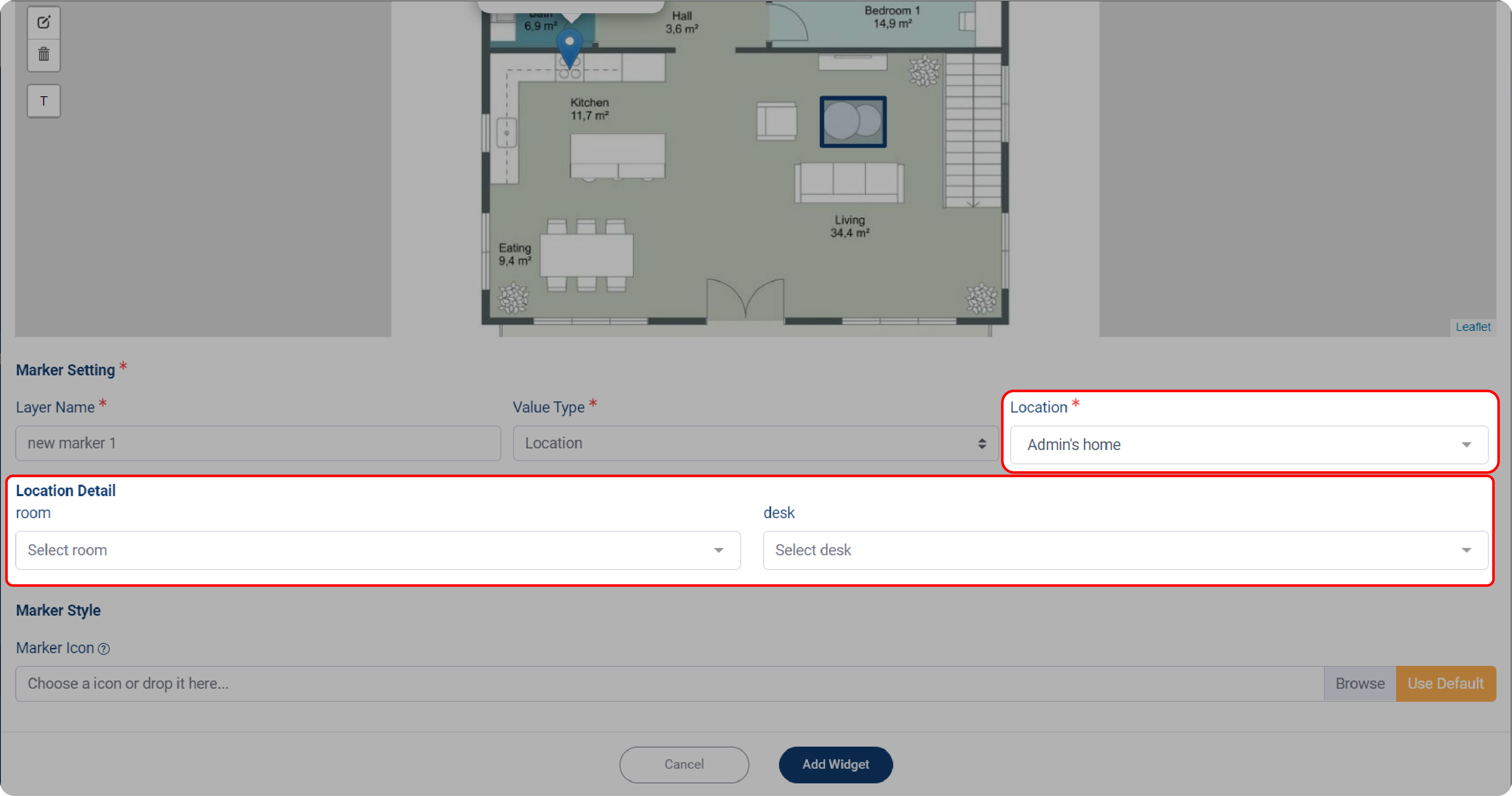
4. Set the Marker Style by clicking on Marker Icon and uploading your device’s image or icon.
5. If you want marker as your label, click Use Default.
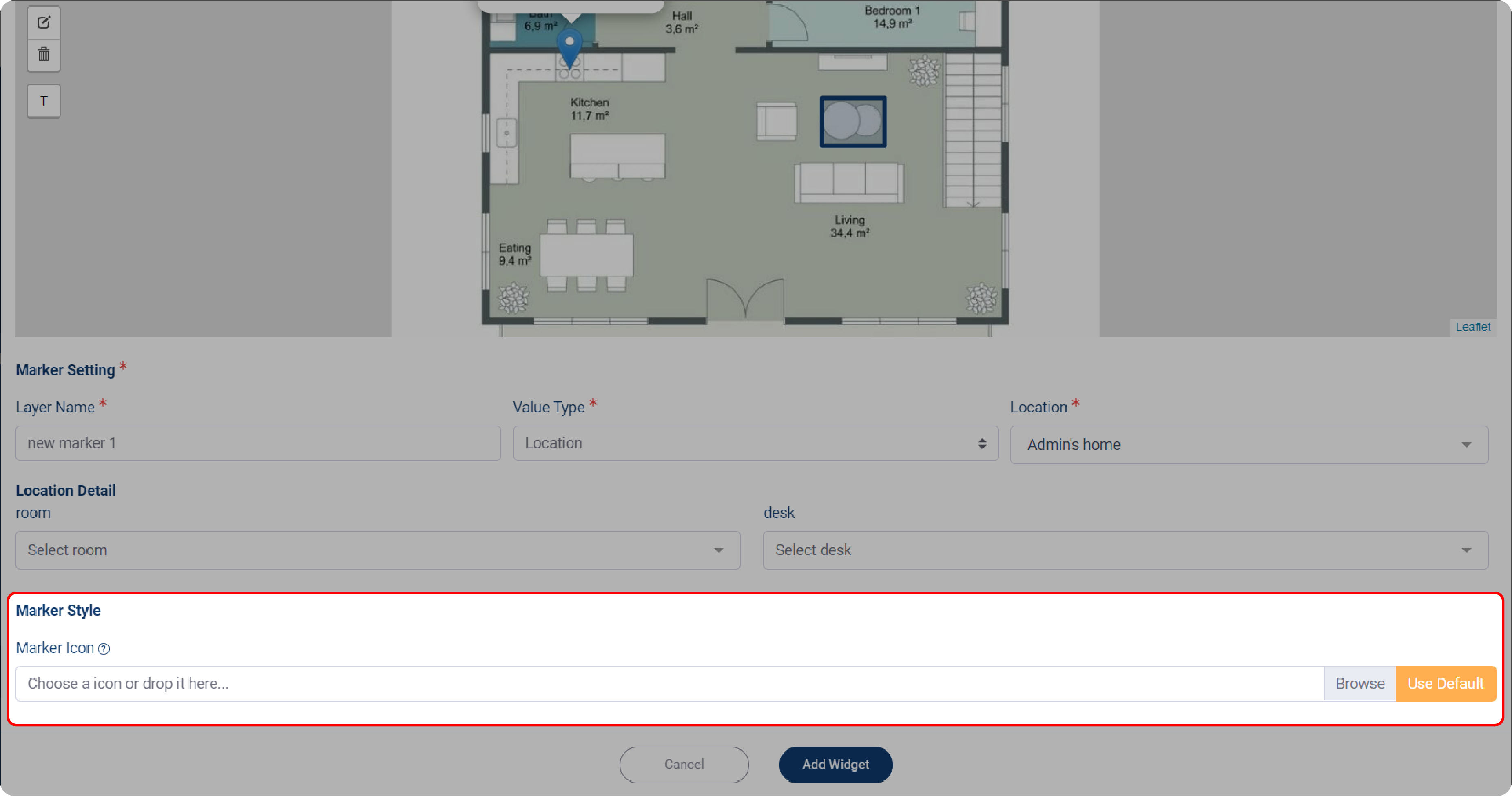
6. Click Add Widget when done. The location detail will be displayed on the map preview.

