Having your own dashboard that displays data from your devices may assist you in monitoring the condition of a specific location. Besides that, you can manage your panel using the various widgets that we provide. It is good to know to understand how to customize your own Dashboard on IoT Stadium. We’ll give you a quick overview of how to customize the Dashboard and walk you through the steps to set up the dashboard access to adding a map of your location and labeling a specific spot on your map.
Set up the Dashboard Access
We offer two options for setting up your Dashboard Access: Private and Public. With the Private setting, you can limit access to users who belong to the same tenant as you. Alternatively, with the Public setting, you can share the link to your dashboard with any IoT Stadium account holder, regardless of their tenant affiliation.

The other users that got link from your public Dashboard only able to see or view your dashboard, and they are unable to edit it.
Choose the Widgets
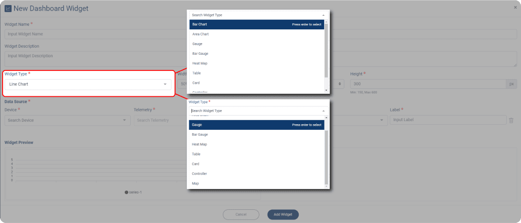
There are ten widgets that you can select ten widgets to help you read the data from your telemetries.
The widgets are:
- Line chart
- Area chart
- Bar chart
- Gauge
- Bar Gauge
- Heat map
- Table
- Card
- Controller Widget
- Map widget

Each widget offers distinct advantages that depend on the number of telemetries selected and the data measured.
For instance, a line chart is well-suited to track changes over time when the measurement data is not significantly different. Conversely, a gauge chart effectively visualizes a single quantitative value of data but may not be the optimal choice for comprehensive data analysis

Map Labeling
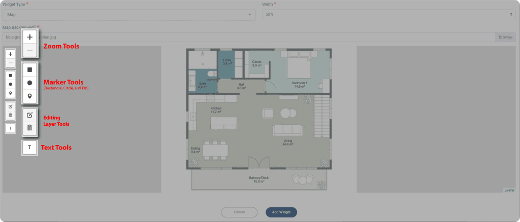
One of the widgets that will help you to mark some specific area from your map that may contain some telemetries or devices. With the help of our Marker Tools, you could add your own label as well as more detail for that location, with the device’s detail or just the location’s detail.


